
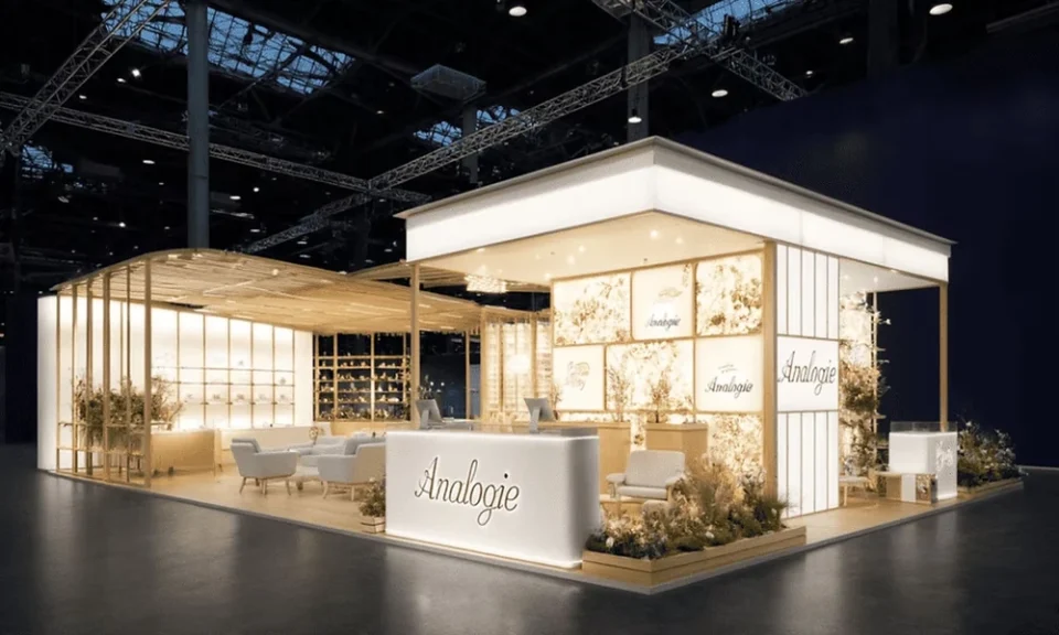
A well-designed booth structure can still underperform if the displays inside it, the graphics, the product presentation, the signage hierarchy, don’t do their job, since visitors respond to what’s actually shown at eye level more than to the architecture surrounding it. Trade show booth displays are a distinct design problem from the booth itself, closer to visual merchandising than to construction, and treating the two as one exercise is a common reason a strong structure still underperforms.
Display Hierarchy: What Gets Seen First
A visitor scanning a booth from a few metres away processes it in a rough hierarchy, largest visual first, then supporting graphics, then detailed product information, which means displays need a deliberate order of importance rather than presenting everything at equal visual weight. Displays that try to communicate five messages at once tend to communicate none of them clearly to someone walking past at trade show pace, which defeats the purpose of the display in the first place.
Product Presentation That Invites Handling
Products displayed behind glass or on inaccessible plinths signal that they’re not meant to be touched, which can suppress engagement even when handling the product would otherwise be a strong part of the pitch. Presenting products at a height and openness that invites a visitor to actually pick them up, where appropriate to the category, tends to produce longer and more meaningful conversations at the stand than a display designed purely to be looked at.
Signage That Works From Both Near and Far
Signage sized to be legible from across the aisle often becomes visually overwhelming once a visitor is standing directly in front of it, while signage designed only for close reading fails to draw attention from a distance in the first place. Layering signage, a bold distant-read headline paired with smaller supporting detail for visitors already inside the booth, solves both problems without compromising either.
Graphic Consistency Across Every Surface
Displays that mix graphic styles, one panel in a corporate template, another in a looser campaign style, read as disjointed even when each individual panel is well designed on its own terms. Establishing a single consistent visual language across every display surface before fabrication begins avoids a stand that feels like several separate projects stitched together under one roof.
Working With Specialists Rather Than In-House Alone
Marketing teams are often strong on messaging but less experienced with how displays actually perform physically in a hall, under specific lighting, at specific viewing distances, which is where bringing in a decor company experienced with exhibition environments specifically tends to catch problems an in-house team working from a desk would miss until the show floor.
Digital and Physical Displays Working Together
A screen playing content unrelated to the physical displays around it creates a split focus that dilutes both elements rather than reinforcing the message, while digital and physical displays designed together, sharing the same visual language and narrative, reinforce each other and hold attention longer.
Designing Displays for Repeat Use Across Shows
Displays built as one-off, non-reconfigurable pieces become an expensive proposition for a brand attending multiple shows a year, while displays designed with a modular core and swappable graphics can be refreshed for each new event at a fraction of the cost of rebuilding from scratch. Planning for that reuse at the design stage, rather than treating each show as a standalone project, changes the economics of a busy trade show calendar considerably.
Testing Displays Before the Show Floor
A display that looks correct on a design render can still have readability or lighting problems that only become obvious once it’s physically built and lit, which makes a pre-show walkthrough under representative lighting conditions worth the extra day it takes to arrange. Catching a legibility problem in a warehouse costs a fraction of what it costs to discover the same problem on the actual show floor.
Budgeting Displays Separately From Structure
Display graphics and finishes are sometimes treated as a rounding error against the structural build cost, even though displays are what most visitors actually engage with directly. Budgeting displays as their own line item, rather than whatever remains once the structure is paid for, tends to produce a noticeably stronger result for a comparable total spend.
Where Displays End and Experience Begins
The strongest booths blur the line between static display and interactive moment, treating the display itself as the entry point into a broader experiential design rather than a separate, purely visual element bolted onto an otherwise interactive stand. Thinking about displays as the opening beat of a larger brand experience, rather than a finished exhibit in themselves, is what separates a booth that gets photographed from one that gets genuinely explored.
